
Eye-catching
Figma design

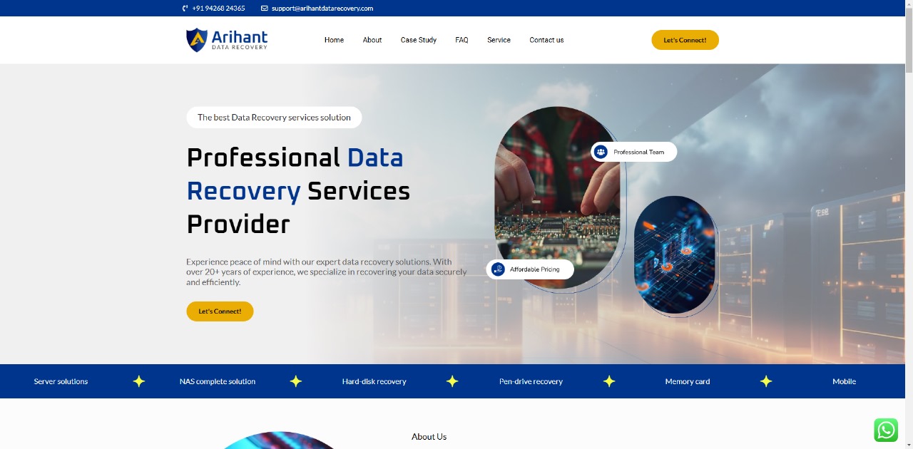
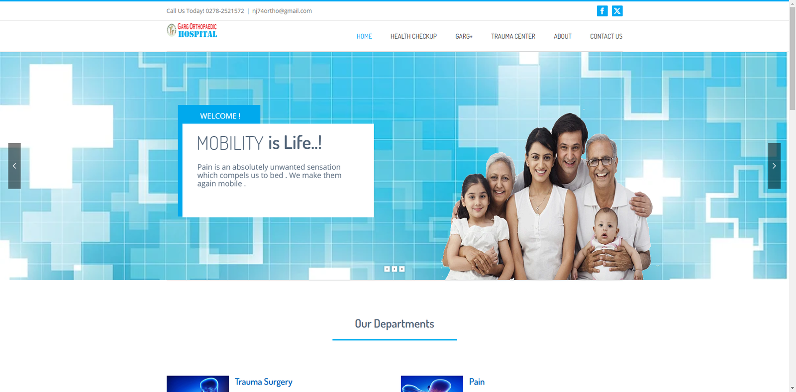
WordPress
Expert
WooCommerce
Specialist

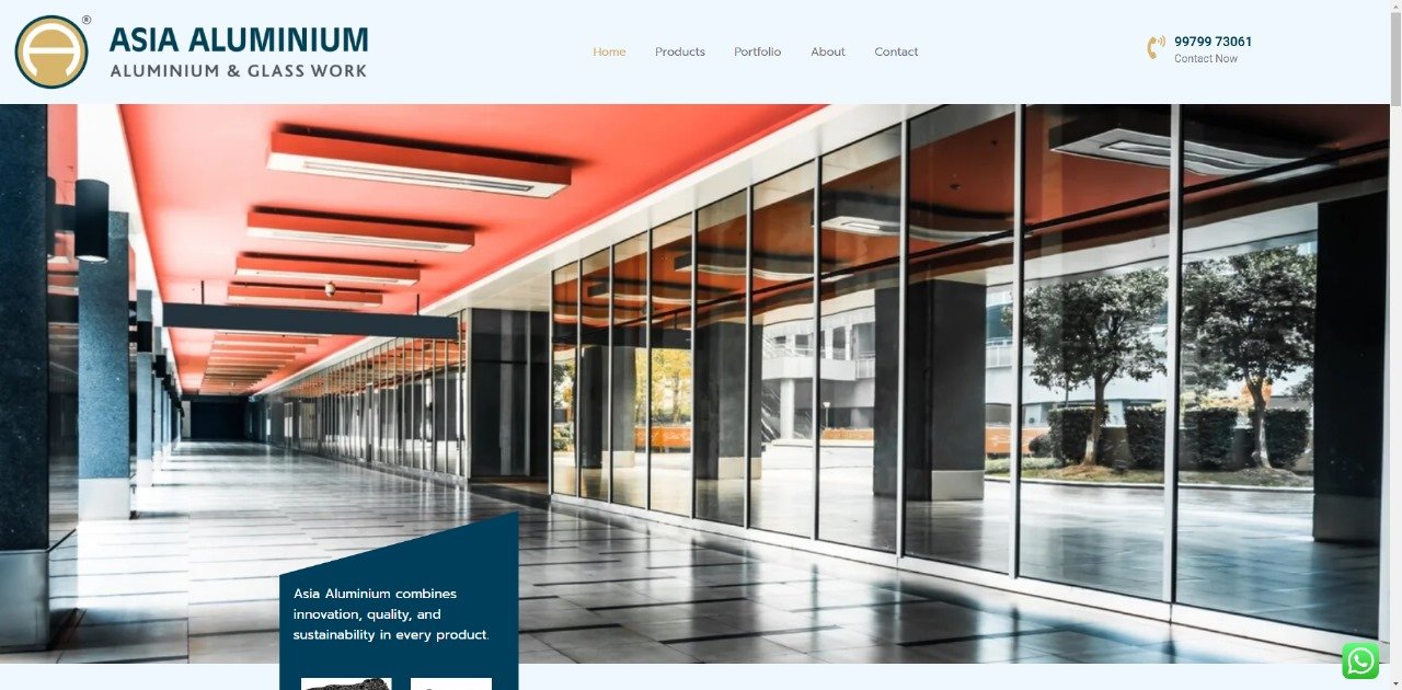
Shopify
Partner
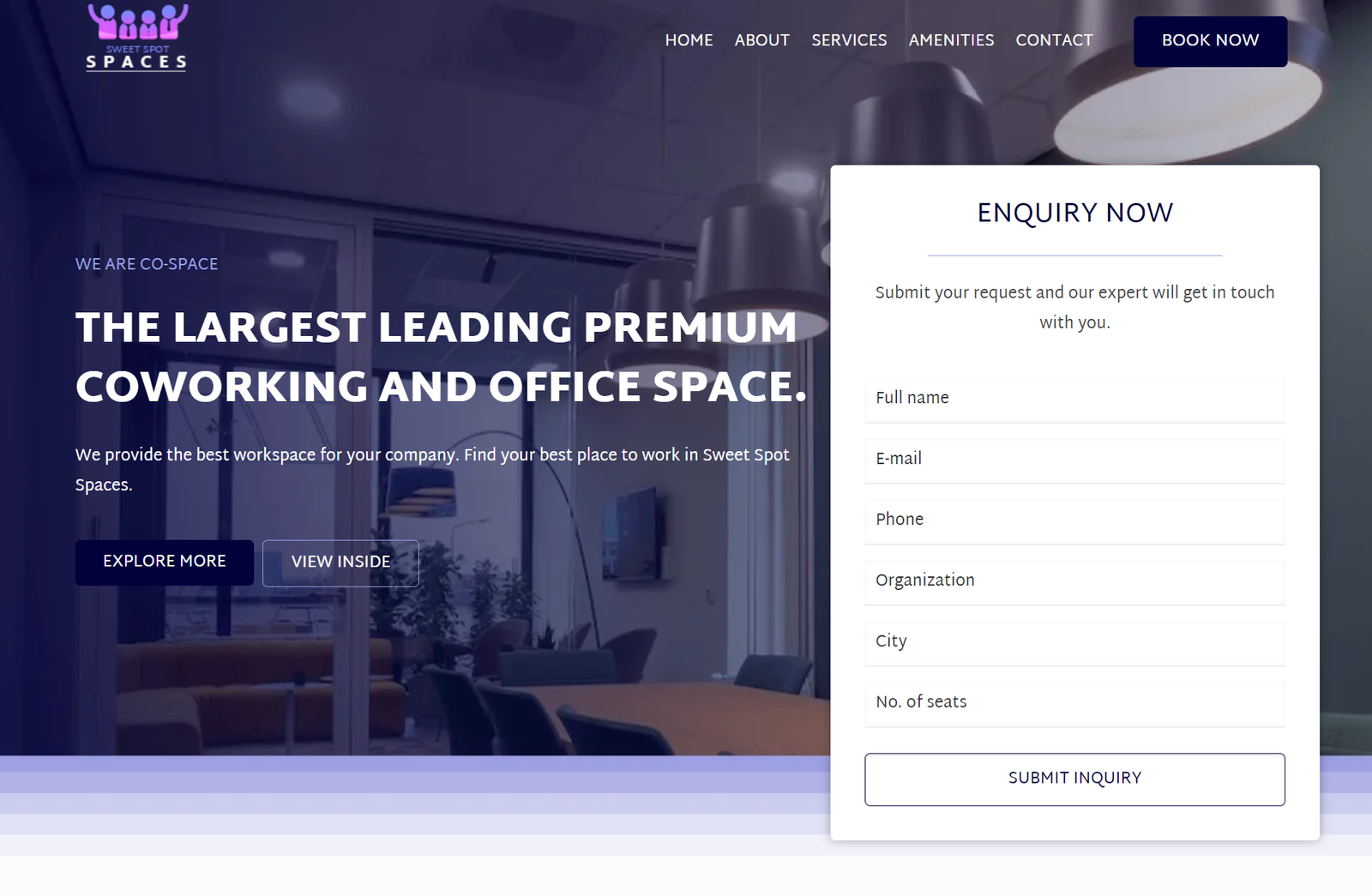
Laravel
development


Google Fonts
1.7K+ fonts
Figma designs
Customize designs


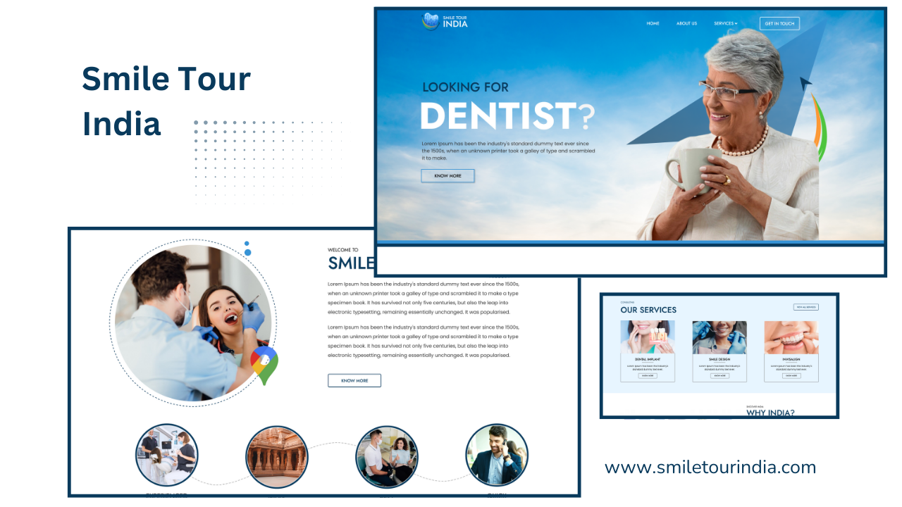
Smile Tour India
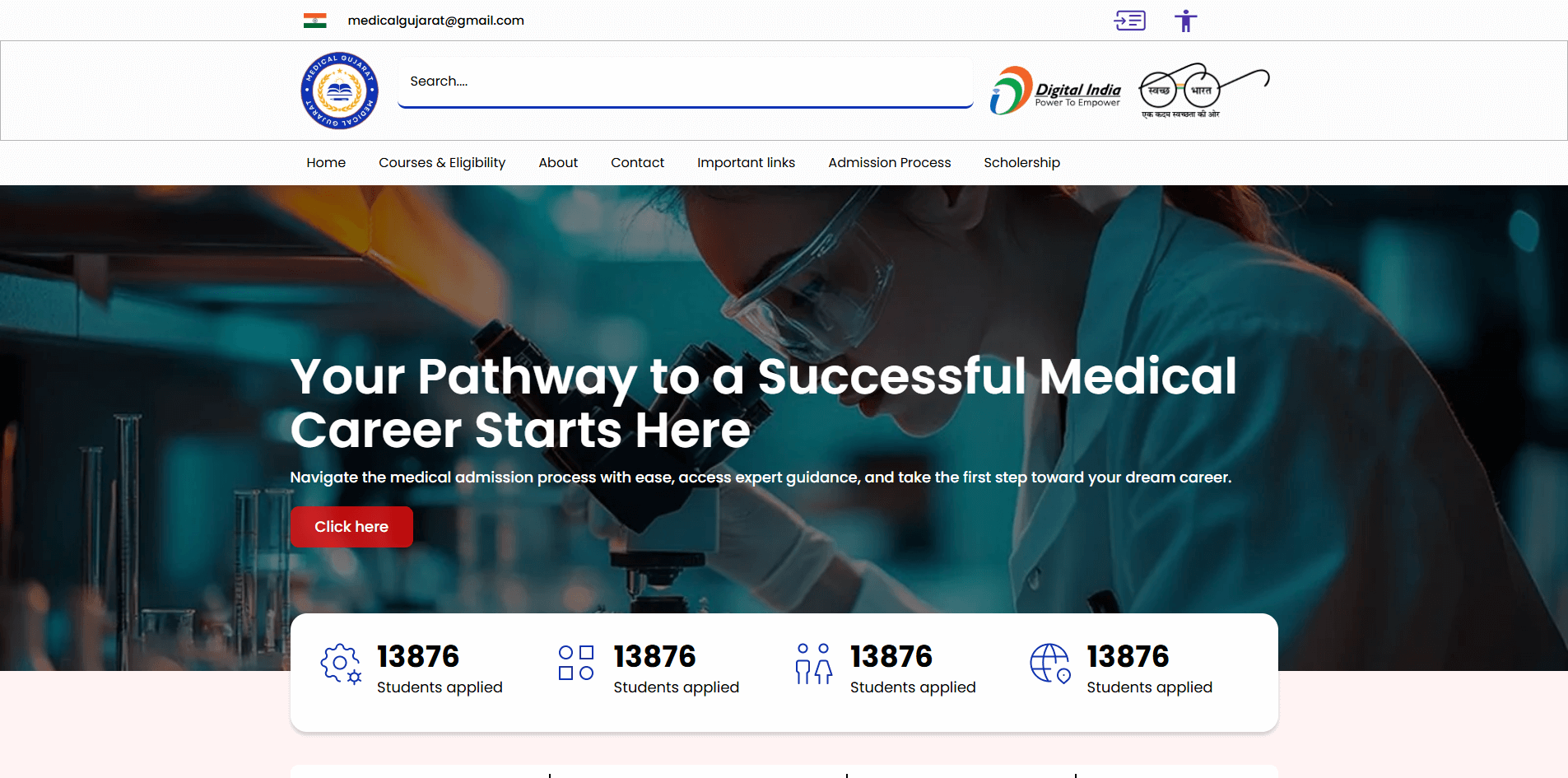
Medical Gujarat
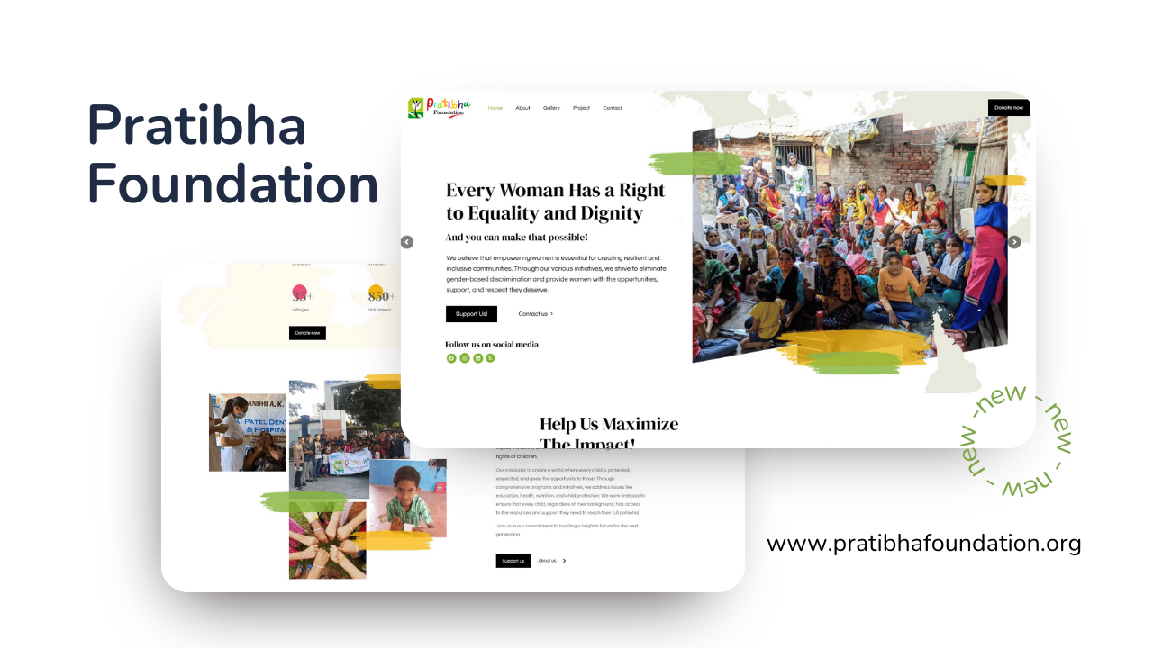
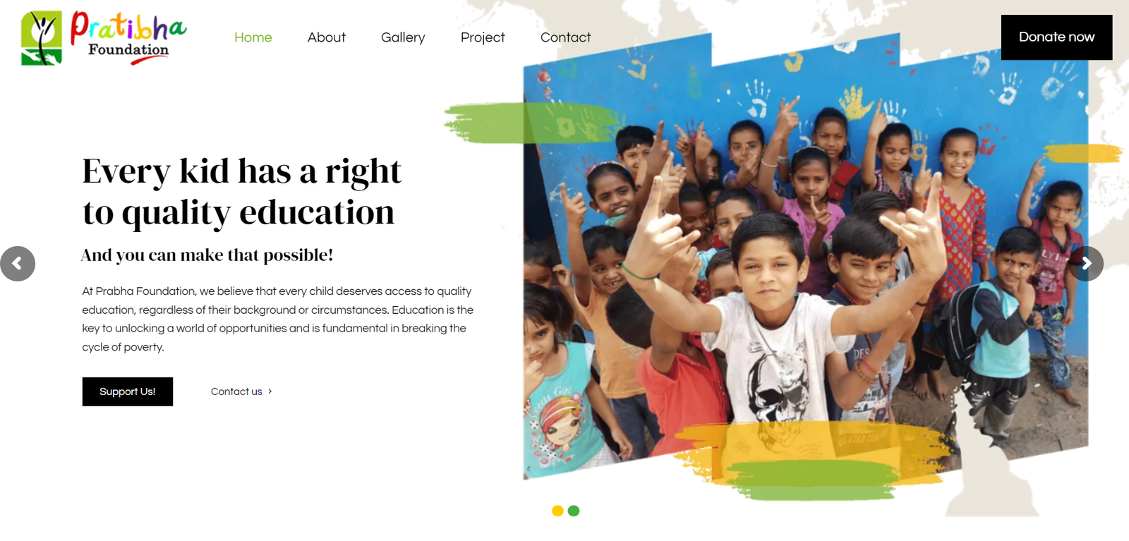
Pratibha Foundation
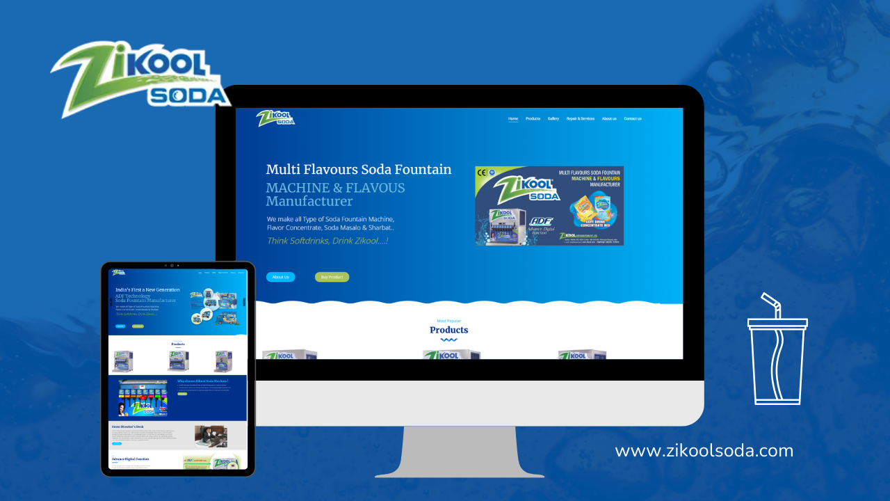
Zikool-Soda
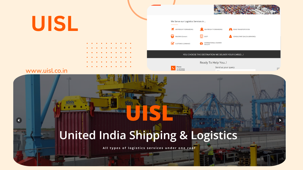
UISL
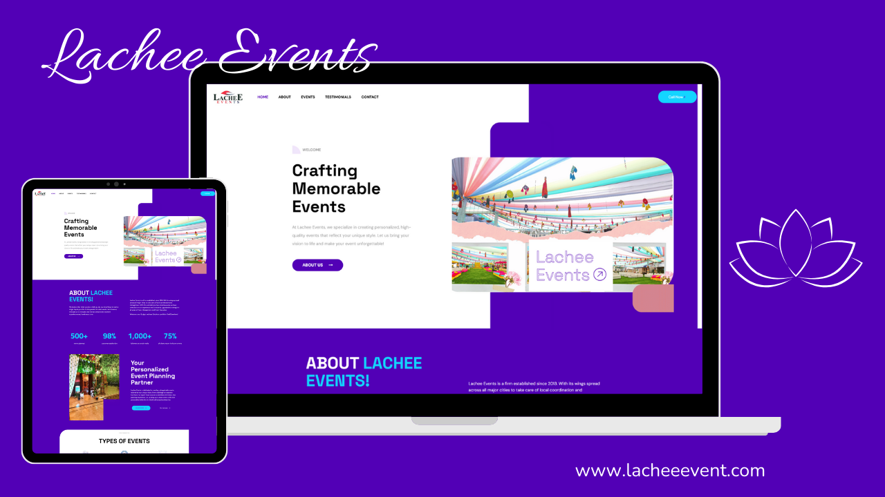
Lachee Events
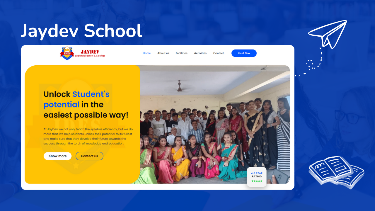
Jaydev School
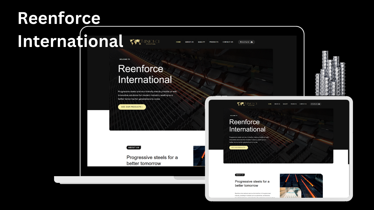
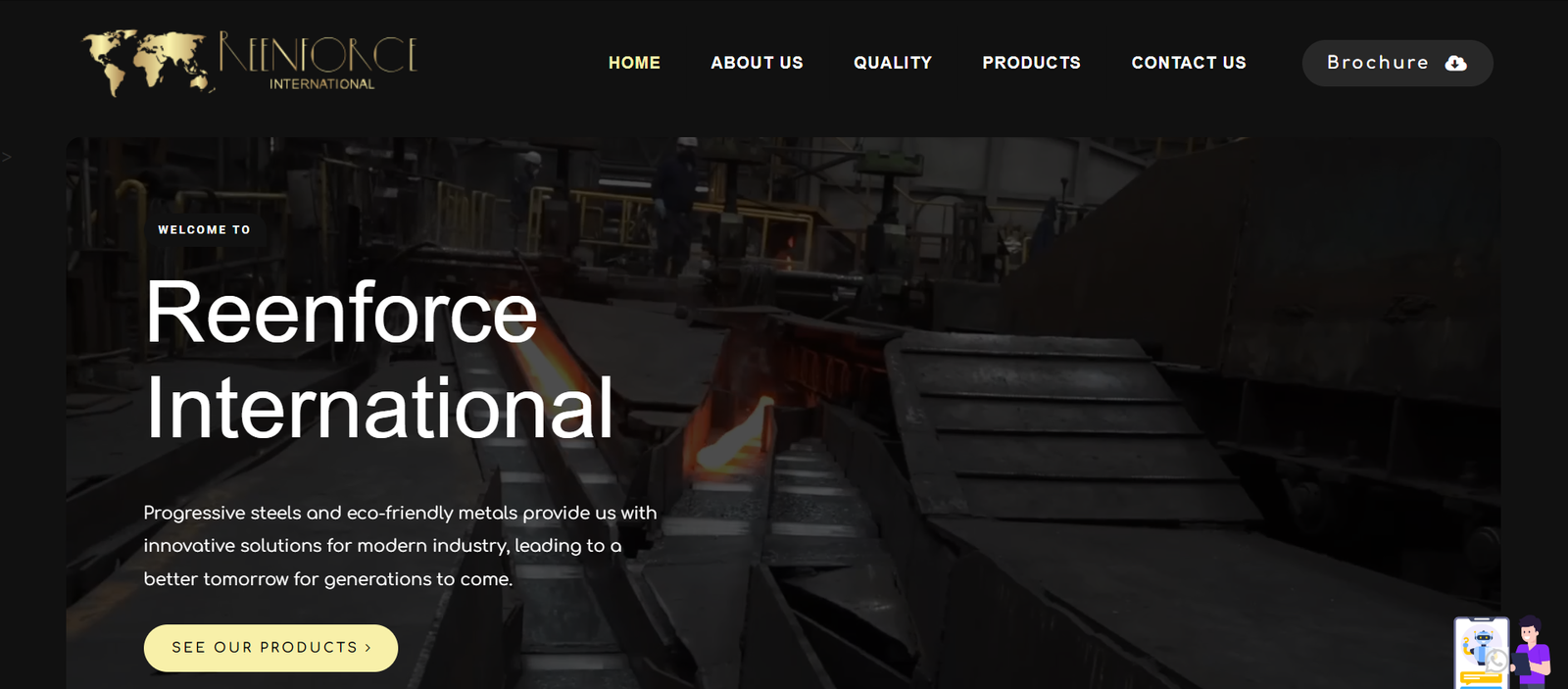
Reenforce International
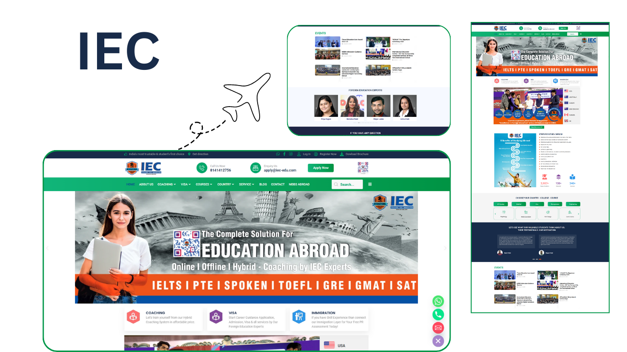
IEC Global
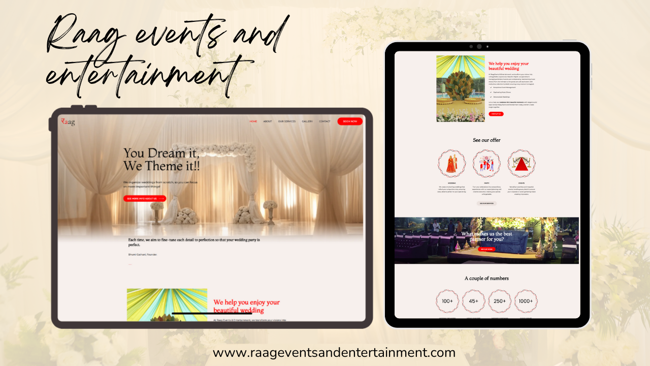
Raag Events
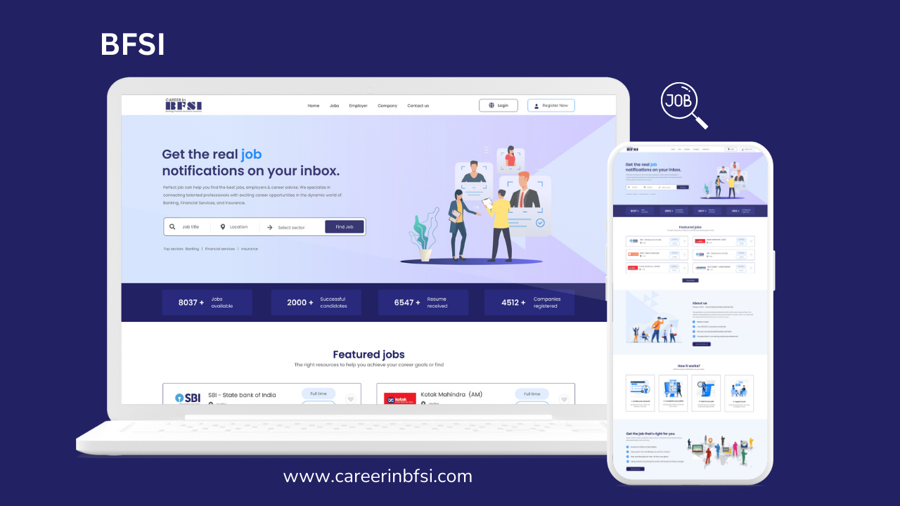
BFSI
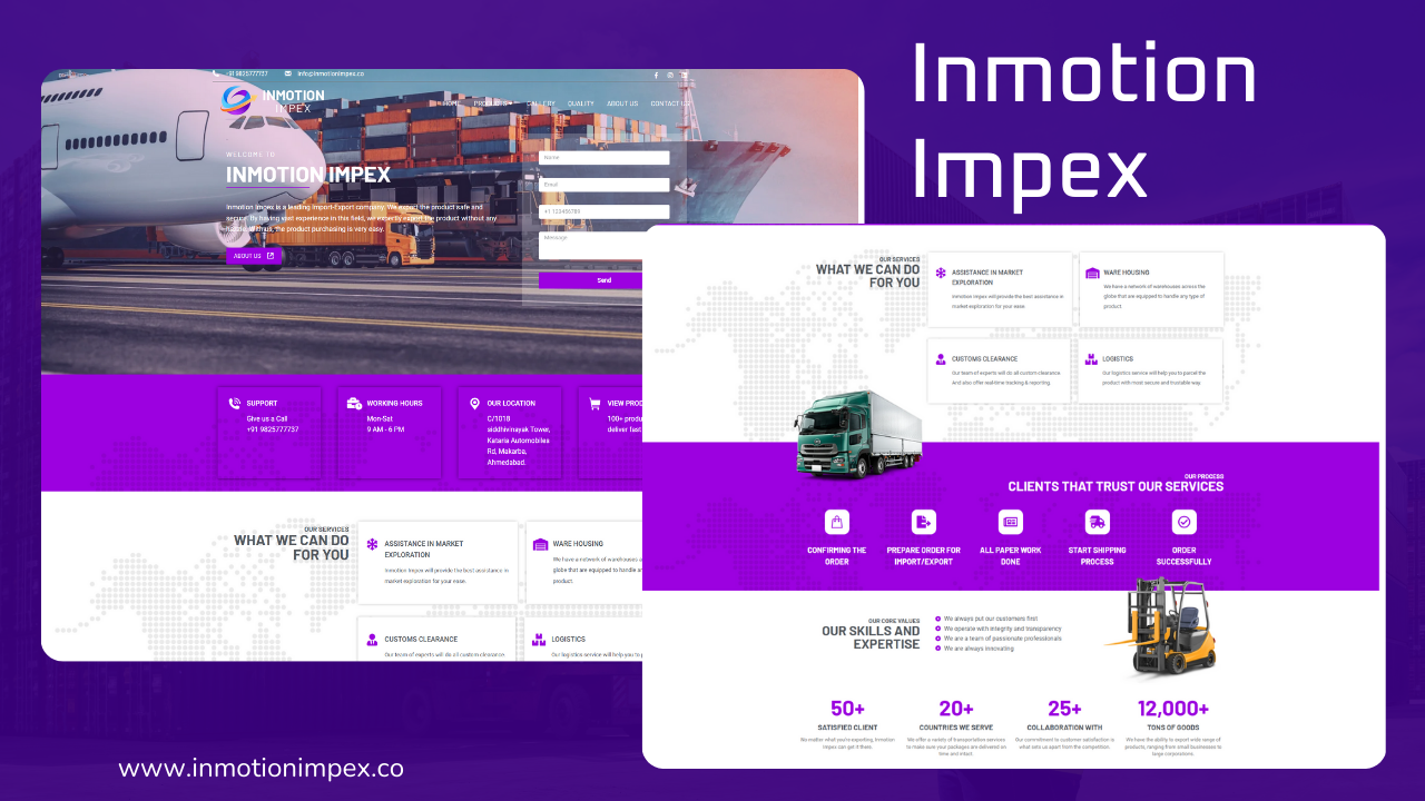
Inmotion Impex


